A graphic mark is a visual representation of the brand as a whole, that is, the visual identity of a brand. So, what is the visual brand identity? It is a set of elements or characteristics that make up a brand, making it unique and differentiating it from others.
The elements that make up the brand as a whole contribute consistency and flexibility to this unit, respecting a series of regulations for use, which are gathered together in what is known as the corporate identity manual.
That is, the visual identity or graphic brand is in charge of visually capturing the concept and qualities of the brand, within a coherence.
We cannot confuse visual identity with branding since it encompasses the entire process of building a brand. Throughout this process we define both the identity, as well as the interests, aspirations, marketing strategies among many other aspects.
The visual identity of a brand is made up of a series of tangible elements, constituting the minimum elements of which a brand must be composed in order for it to be well structured and recognizable.
5 elements that make up the visual identity
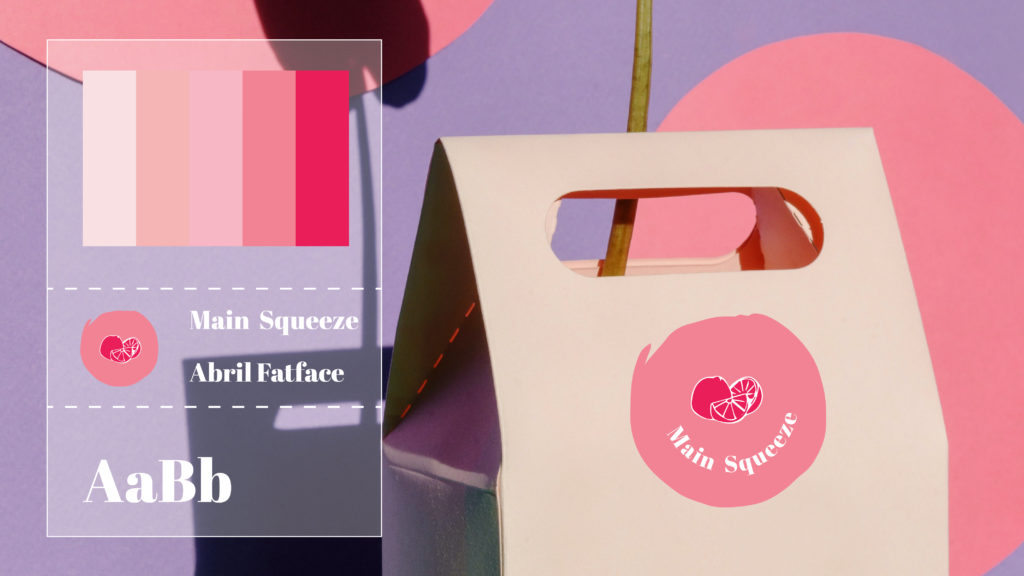
Logo logo in visual identity
The logo is the central element, it is the visual representation through which we identify the brand, giving it differentiation and recognition. This is made up of typographic and graphic elements, whose combination and composition have to communicate a clear and direct message. In addition, it must be flexible, to adapt to different formats, so that it is readable and recognized in different media, formats and platforms, such as its adaptation to a mobile application. Let’s see the most important points to take into account so that a logo is an effective hook to capture attention:
- Scalable, which allows its reproduction on any support without losing quality or sense, be it on a billboard or a business card. It should be done vectorially to facilitate its scaling.
- Reproducible on any type of material or surface.
- Distinguishable regardless of the background, both positive and negative.
- Memorable, that leaves a mark on the public.
Typography
Typography is a very important element in the graphic set of the brand, so it is extremely important to define the fonts, taking into account the weights and sizes, in order to prioritize the information depending on the type of support or content.
This element can be divided into two types, establishing a main or corporate typeface, which will be the one that accompanies the logo or as the main typeface for texts and main information; and a secondary font, which supports and complements the main font, being used in complementary texts or bodies of informative texts on different platforms.
Normally, you usually play with fonts in weights and families, such as using sans serif fonts with roman fonts (with serif). In any case, at most the use of two different fonts is recommended.
Color
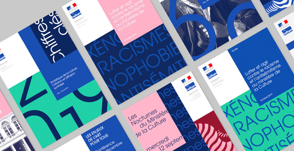
The color palette is a decisive element in the creation of the graphic brand, providing symbolic value and establishing a relationship with its concept.
As with typography, a primary or corporate color palette must be established, which will include the main color or colors of the brand, that is, those that are recognized and linked to the brand at first glance; and a secondary palette, which is usually made up of colors that are complementary to the main palette, and that will complement them.
This color palette must be structured in such a way that its applications are clear. It will be determined when the colors belonging to the corporate palette should be used and when those belonging to the secondary one. The use of these colors must be done bearing in mind that colors generate emotions and associations of ideas. For this reason, the correct application of these palettes will reinforce the message that the brand tries to convey.
Photographs
Having an image bank in keeping with the style of our brand is essential to achieve a real impact on the audience. These elements must be consistent with the message we want to convey and market. It is important to define the identity to perform this step optimally. We need to consider whether our brand has a formal or informal style, the topic we deal with, how we relate to users, the company’s values, and what sets it apart from the competition.
Illustrations, textures and complementary elements
On numerous occasions the brand is accompanied by illustrations, patterns, textures, icons, etc. in order to reinforce a certain message. The key to using this type of element is to be consistent with the brand image and not stray from the established design line. With this I do not mean that we cannot innovate in matters related to design. We can do it but with nuances.